E-commerce

RayBan

toggle scrollable contents
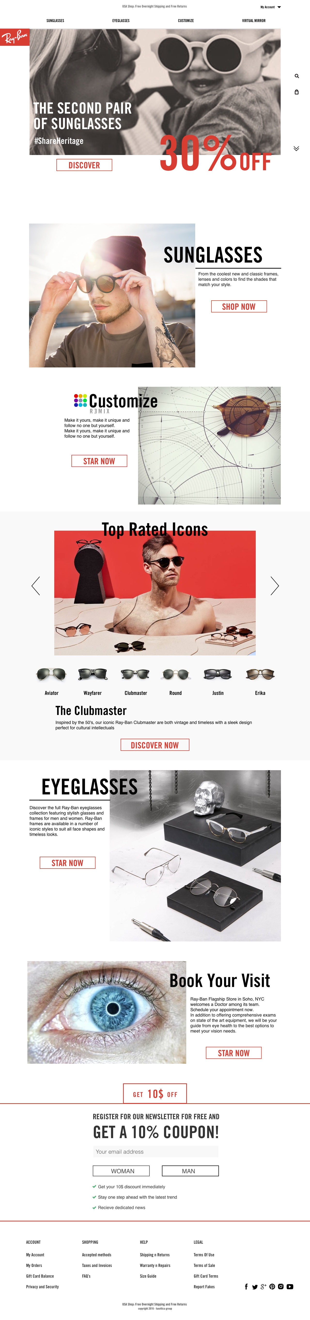
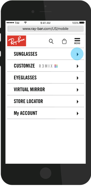
scrollable
scrollable mac

_ VISUAL REFIT

We focused on a global visual refit and a deep user experience enhancement.The redesign should aim to solve ray-ban.com most important issues and to leverage on Ray-Ban strategy to increase revenues during the holiday season.

Brief includes a luxurious and premium experience on the whole website, achieved by great storytelling, visual consistent brand identity, intuitive ux and eye catching contents.

_ EDITORIAL LAYOUT

The contents are arranged vertically and grouped in sections, now with different font hierarchy. An assymetric layout based on a triple overlapped grid allows to have dynamic flow but still structured.

Overlapping texts and images is a technique from editorial field, in this case is used to give freshness to the page.

mobile UX flow

_MOBILE UX

Since Ray-Ban sells more than 2k of products online, the navigation is divided in steps to narrow down the results and creating a natural navigation flow to reach all products. The 4th step contains a hint with the most relevant products before "view all" CTA, to give a chance to get the right item as quick as possible.

PROJECT

eCommerce / Ux

DELIVERABLES

Ux paths, mobile and desktop prototypes

TEAM

Diego Bernal

Matteo Barone

Anatasia Melnichenko

previouvs project
3/7
previouvs project